How Does M1 Relate to Inflation?
According to Austrian Economics an increase in the money supply should result in inflation as the value of each old dollar is "diluted" by the printing of new dollars.
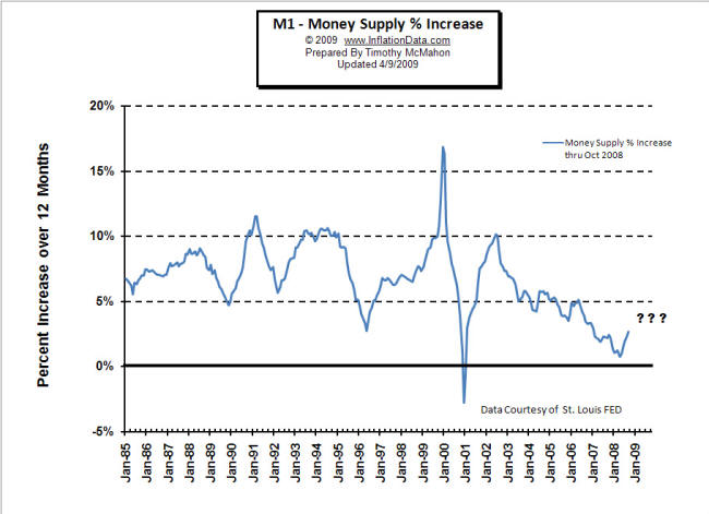
In the chart below, we have the M1 money supply from 1985 through October 2008. It shows the percent change over the previous 12 months.
(Click chart for larger image)
M1 is the most restrictive measure of money supply since it only measures the most liquid forms of money; it is limited to currency actually in the hands of the public. This includes checking accounts travelers checks, and other deposits against which checks can be written.
As you can see... from 1985 through 2000 the money supply generally increased somewhere between 5% - 10% a year. But then in 2000 the money supply went crazy shooting up and then crashing down before returning to 10% and then declining.
So during that time what happened to the inflation rate. You would think that if the money supply controlled the inflation rate we should be able to see some sort of relationship.
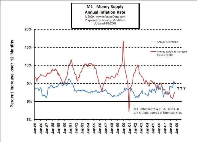
So in this next chart we see the M1 percent increase combined with the inflation rate.
(Click chart for larger image)
At first blush it doesn't look like there is any relationship between them at all. M1 money supply is bouncing all over the place while the inflation rate is not quite as volatile but appears totally unrelated.
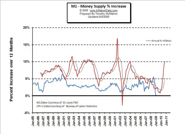
But then we have to remember that there is a time lag as the increase in the money supply floats around the system. Typically the time lag is considered to be from 12 -18 months. So if we introduce a time lag into the money supply chart this is what we get.

(Click chart for larger image)
So in this chart we can see that during the 1980's the money supply numbers lined up pretty well although the money supply increase was higher than the reported inflation rate.
In the 1990's we saw inflation to be relatively flat while money supply spiked up above 10% on two different occasions. See circle #1 . So how can this be? Well during the 1990's we had an unusual situation where former closed Communist countries were becoming more open and using very low cost labor to sell goods on the world market. This allowed the United States to print extra money and buy these low cost goods effectively exporting much of its inflation.
But what happened in the massive spike in circle #2. In that case the excess money went into creating the "Dot Com" bubble. So rather than causing consumer prices to increase it caused other assets (stocks) to increase in price instead. The crashing stock market reduced the M1 money supply as people drew down money in their checking accounts as their other assets decreased in value.
The government feverishly tried to reinflate the money supply and the money promptly went into the housing bubble once again rather than driving up consumer prices. As housing prices crashed they pulled other assets down with them, once again sucking up excess liquidity until the consumer inflation rate actually got very close to zero.
So what is in store for us next? I purposely removed the most recent money supply data so that now that we have looked at the past we can understand more of what is in store for the future.
(Click chart for larger image)
As you can see in the most recent 6 months the money supply has increased from a growth rate of a couple of percent up to about 10%. Interestingly it is not up to the peak levels of the 2000 run-up. But if history is any indicator we can expect one of two outcomes either significantly higher consumer price inflation or another asset bubble.
Other Articles:
- Stock Market- Stock Trends by Month
- Rising Food Prices- Agflation- What is it?
Velocity of Money:
Misery Index:
 Connect
with Tim on
Connect
with Tim on
Use our custom search to find more articles like this

Share Your Thoughts